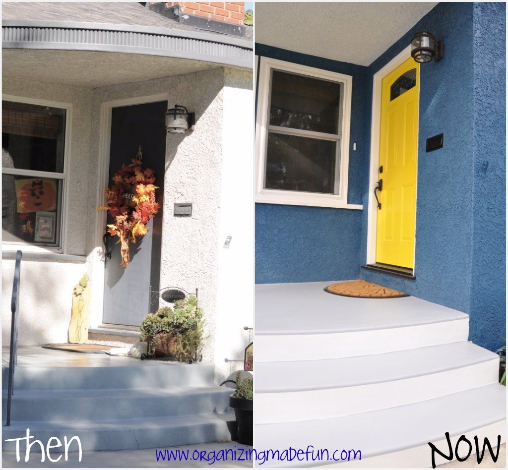
Isn't this front entry amazing? I realize that some people would FREAK out at having a dark blue house and a yellow front door...but I'm not some people! I have to be honest...photographing the new color of our house has been a challenge! Big challenge - so it looks MUCH more "smurf blue" in photos - but when people come over they say that it looks so much better in person! The name of the color is "Stormy Sea" by Dunn Edwards.

Here is a little then/now photo so you can see what we started with. I never liked the color of the house - well, it was a non-color that I called "yuck"! The front entry I took a picture of this fall to show you what it started like. And now, it looks so warm and inviting! Of course, I got a new doormat, too - rounded to match the round steps and overhang of our front porch. I've got plans for some planters on the front porch...that will be coming soon!

I also have many details of the paint job here. My painter was AMAZING! I am not normally a picky person, especially when it comes to home projects. But, I had many very specific things I wanted to do with the SIX colors he painted on our house. You can see on the front porch there are five of the colors {black, white, gray, blue, yellow}. The stucco goes all the way up and around the overhang but I had him paint white on the ceiling of the overhang to make it seem taller and higher. I had him paint the detail black on the semi-circle overhang to bring it out.

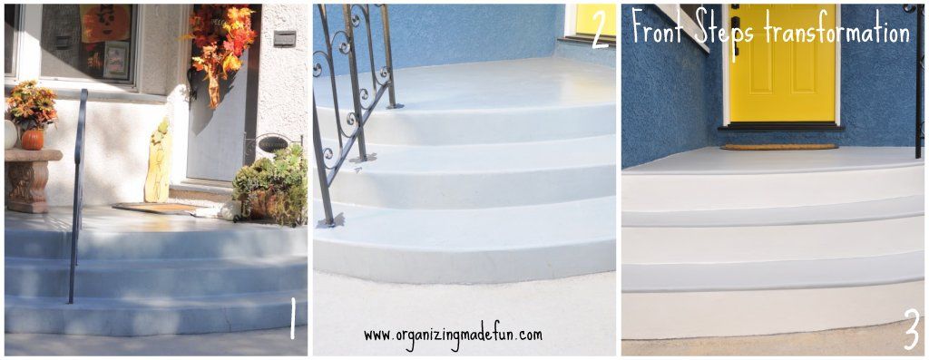
The steps were another detail that I specifically had a vision for. I didn't want the flat color...before they were just painted one color. My vision was to paint it two toned. Notice that the first picture shows the paint before - faded and old - the next picture shows after he used a clear primer to ready it for the gray paint. The third shows the result of what I asked for - an illusion that it's got an overhang/lip with white risers and gray treads.

He carefully measured it and taped it precisely. It looked just like I had imagined in my head...Oh, and some of the many stairs I saw on entries on Pinterest under my House Paint Board. You can also see where I got the idea for these colors! Ok...are YOU a beige house kind of person, or a not-so-beige house person?

